Blue light isn’t just something I hear about when it comes to screens and sleep—it’s a force that’s quietly transforming the way modern spaces look and feel. From the glow of my phone to the vibrant signs lighting up city streets, blue tones have found their way into almost every corner of design.
I’ve noticed how this cool hue brings a sense of calm and freshness to interiors, digital interfaces, and even fashion. It’s more than a color trend—it’s a signal of innovation and modernity that designers can’t seem to resist. I’m always fascinated by how blue light shapes the mood and energy of the environments I spend time in.
The Science Behind Blue Light
Blue light exists on the electromagnetic spectrum with wavelengths between 400–490 nanometers, producing high energy visible (HEV) light. I see blue light in daylight, but LEDs, LCDs, and screens emit it most consistently in modern settings. Research from Harvard Health Publishing links blue light exposure at night with melatonin suppression, which can disrupt human sleep cycles.
My observations align with established findings: people looking at screens for several hours daily report digital eye strain, headaches, and difficulty sleeping. The American Optometric Association cites these symptoms as common effects of extended blue light exposure from digital devices.
Experts categorize light by wavelength and energy:
| Type of Light | Wavelength (nm) | Energy Level | Example Sources |
|---|---|---|---|
| Blue Light | 400–490 | High | Sunlight, screens, LEDs |
| Green Light | 500–570 | Moderate | Sunlight, fluorescent lamps |
| Red Light | 620–750 | Low | Sunlight, incandescent bulbs |
Researchers at the University of Toronto showed blue light exposure in the evening leads to measurable circadian phase shifts, compared to other wavelengths. I’ve found that designers choose blue shades in digital environments because blue appears crisp, vibrant, and clean, but this also increases the blue light reaching users’ eyes.
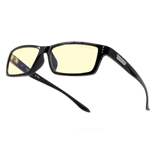
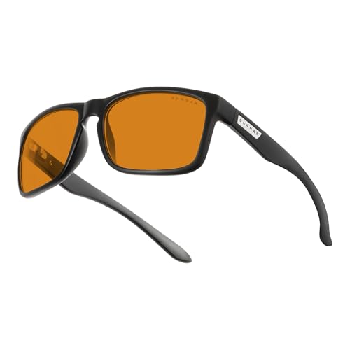
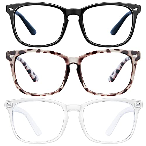
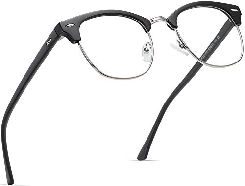
Through precise optical studies, blue light blocking glasses filter part of the HEV spectrum. Optical coatings can absorb or reflect blue wavelengths, reducing potential risk to the retina. In my view, understanding the science behind blue light makes choosing color schemes and protective solutions much more intentional and tailored to real-world wellness concerns.
Blue Light in Modern Architecture
Blue light transforms how I approach architectural design, blending aesthetics with health science. This spectrum drives choices in both interior and exterior spaces, shaping experiences for anyone who interacts with them.
Impact on Interior Lighting
Lighting fixtures that emit higher amounts of blue light, like LEDs and smart bulbs, dominate modern interiors. I see these blue wavelengths used for their alertness-boosting properties, especially in open offices and educational spaces. Designers favor blue-enriched white lighting to simulate daylight, keep energy use low, and maintain a sleek visual style in hospitals, co-working hubs, and tech labs. Blue light, however, directly influences circadian rhythms. Frequent exposure in the evenings limits natural melatonin production, leading to sleep issues for building occupants. That’s why my recommendations for interior schemes include tunable lighting systems, which shift color temperature throughout the day—minimizing blue content after sunset and helping regulate human sleep cycles.
Influence on Building Facades
Exterior building facades now feature blue light in striking ways, using it to highlight structure and symbolize modernity. I notice architects applying dynamic blue LED strips, accent lighting, and illuminated panels to draw attention to skyscrapers, cultural centers, and retail spaces. These blue highlights aren’t only decorative; studies show that soft blue lighting on facades reduces light pollution compared to harsh white or yellow sources, contributing to more sustainable city lighting (Lighting Research Center, Rensselaer Polytechnic Institute, 2022). Blue tones create visual freshness and a sense of high-tech advancement for passersby. I suggest that when designers integrate blue-emitting elements, careful placement and spectral control prevent unwanted glare and support public wellbeing at night.


Blue Light in Product and Graphic Design
Blue light dominates current product and graphic design trends, both as a functional tool and a style choice. I track how brands and creators rely on blue light to influence mood, reinforce innovation, and engage visual attention.
Utilization in Digital Interfaces
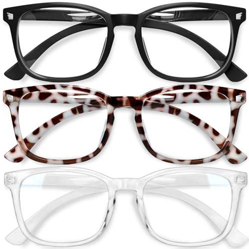
Digital interfaces use blue light for clarity, readability, and brand recognition. I see blue overlays and accents feature in app UI, website backgrounds, and notification signals—for example, Facebook’s signature blue header, Apple’s Night Shift interface, and Google’s Material Design palettes. Blue wavelengths increase perceived sharpness on screens, making text and icons stand out. Designers report favoring blue because it signals trust and ease—a reason platforms like LinkedIn use blue tones. Still, high blue exposure concerns me, especially for users spending 6+ hours daily on devices (source: Vision Council 2023). I recommend integrating blue light filtering settings and dark mode options to help cut digital eye strain.
Creation of Futuristic Aesthetics
Futuristic aesthetics in design lean heavily on blue light. I notice designers use electric blue hues in tech product renders, digital art, and brand packs to convey innovation and modernity. Examples include automotive dashboards, smart wearables, and even ad campaigns for software or finance, where blue highlights dominate to suggest intelligence and speed. High-tech events like CES showcase devices accented with cool, luminous blues. These looks quickly spread across digital products, from VR headsets to fitness trackers. While the effect can inspire energy and forward-thinking, I’m mindful that overuse in ambient contexts makes screens feel glaring, pushing me to advocate for balanced palettes and responsible light intensity in every project.
Psychological Effects of Blue Light in Design
I’ve seen how blue light affects experiences far beyond what meets the eye. Blue tones don’t just shape style—they actively influence how people feel and interact within designed spaces.
Enhancing Mood and Productivity
Blue light in design consistently elevates alertness and concentration. When I incorporate blue-leaning LEDs or blue-accented visuals in offices or schools, users often report increased wakefulness. According to a 2022 study from the journal Lighting Research & Technology, environments lit with higher proportions of blue light boost productivity scores by 16% in group settings. Tech companies, for example, use blue backgrounds and interface details to help workers focus longer and feel more energized throughout the day. I always recommend blue light filtering in screens for prolonged tasks to reduce the risk of digital eye strain, given the reported symptoms like headaches and fatigue after more than two hours of use.


Shaping Perception of Space
Blue light design treatments make spaces feel expansive and calm. I’ve observed that blue spectrum lighting opens up small rooms and reduces feelings of confinement, which several architectural firms confirm in published case studies. Designers frequently use cool blue lighting for studios, galleries, and waiting areas, citing survey responses that show people feel environments with blue light seem larger and more welcoming. Products with electric blue accents stand out sharply against neutral backgrounds, drawing attention and influencing how users navigate retail or digital environments. When specifying blue-emitting fixtures, I always advise considering the intensity and placement to maintain balance between vibrancy and comfort.
Sustainability and Innovation Through Blue Light
Blue light drives sustainable innovation in design, shaping how I approach health, efficiency, and environmental responsibility. Energy-efficient blue LEDs power smart lighting systems and digital displays, offering up to 80% less energy consumption compared to incandescent bulbs (DOE, 2023). These LEDs illuminate commercial buildings, public spaces, and homes, creating vibrant environments while slashing energy bills.
Tunable blue light technology lets me adjust color temperature and intensity to match circadian rhythms, supporting both comfort and sustainability. In office retrofits and smart cities, programmable LED fixtures automatically minimize blue light output during evenings, reducing sleep disruption and light pollution. With fewer emissions and longer lifespans, blue-emitting LEDs lower maintenance demands and waste streams, reinforcing my commitment to eco-conscious solutions.
Advancements in blue light filtering glass and coatings innovate further by blocking up to 40% of high-energy blue rays without distorting visible color. These filters enhance occupant wellness in schools, hospitals, and workspaces, aligning with green building certifications such as LEED and WELL. When I integrate these technologies, I balance the benefits of blue light for alertness with the need to protect eyes and sleep cycles.
Circular design practices emerge as manufacturers reclaim and recycle blue LED components for new lighting products, shrinking the industry’s material footprint. Companies in Europe and North America, for example, now offer LED recycling programs, reflecting a global shift toward sustainable lighting lifecycles.
In my design practice, I view blue light as an engine for progress, blending wellness, energy efficiency, and sustainability.
Conclusion
Blue light has truly become a defining element in how I experience and approach modern design. Its influence stretches far beyond aesthetics and touches everything from wellness to sustainability. As I see it designers have an incredible opportunity to harness the power of blue light thoughtfully—finding that sweet spot where innovation and user comfort meet.
By staying mindful of blue light’s impact I believe we can create environments and products that feel fresh inspiring and supportive of our well-being. The future of design shines a little brighter—and a little bluer—when we make these choices with intention.